My role
My role was essentially to make design proposals on different subjects and for different projects.
Context
Our startup LiveMinutes had just been acquired by Fuze and I was working as a web designer from Paris.
In 2015/2016, the Fuze application was split in two: on one hand the applications where the meetings happened (Mac, iOS, Windows, Android) and on the other hand a web application that allowed users to manage their meetings, recordings, access their profile, join a meeting...
Redesign for pages
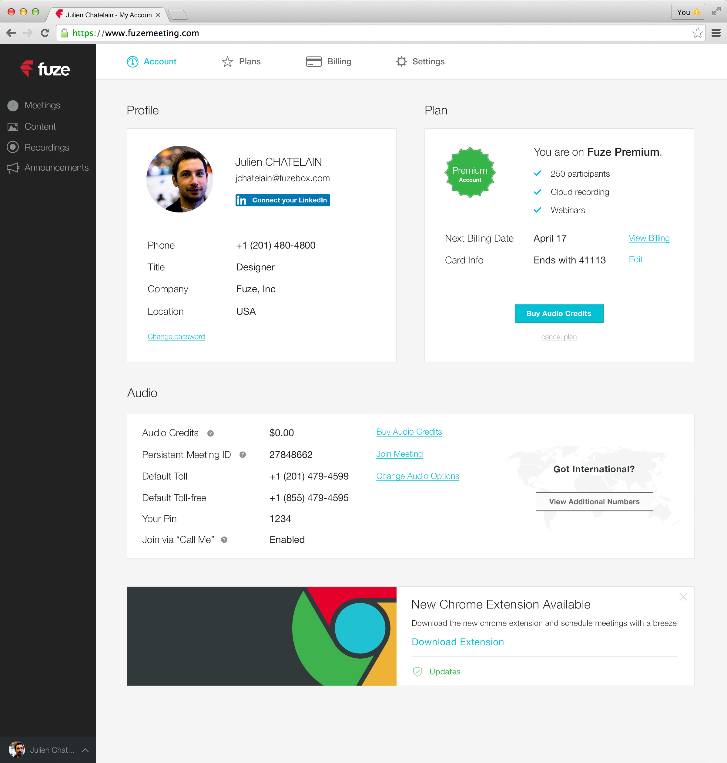
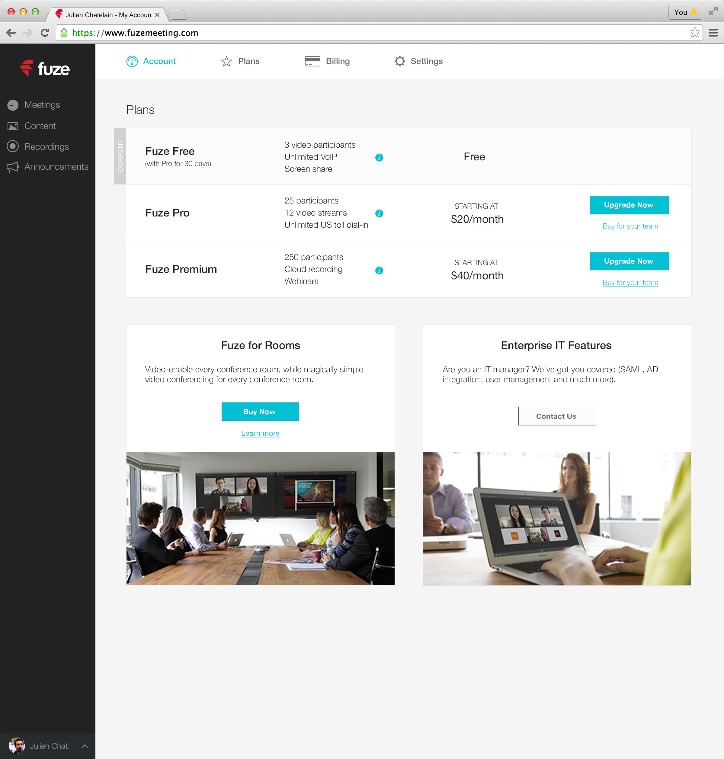
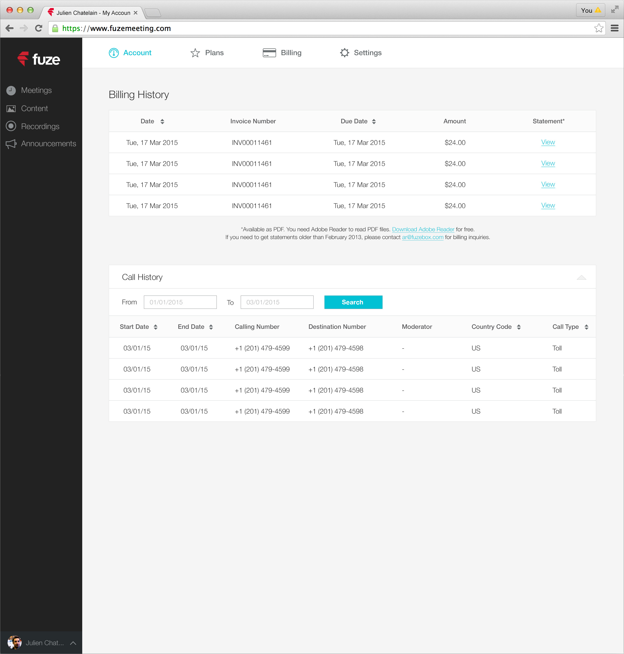
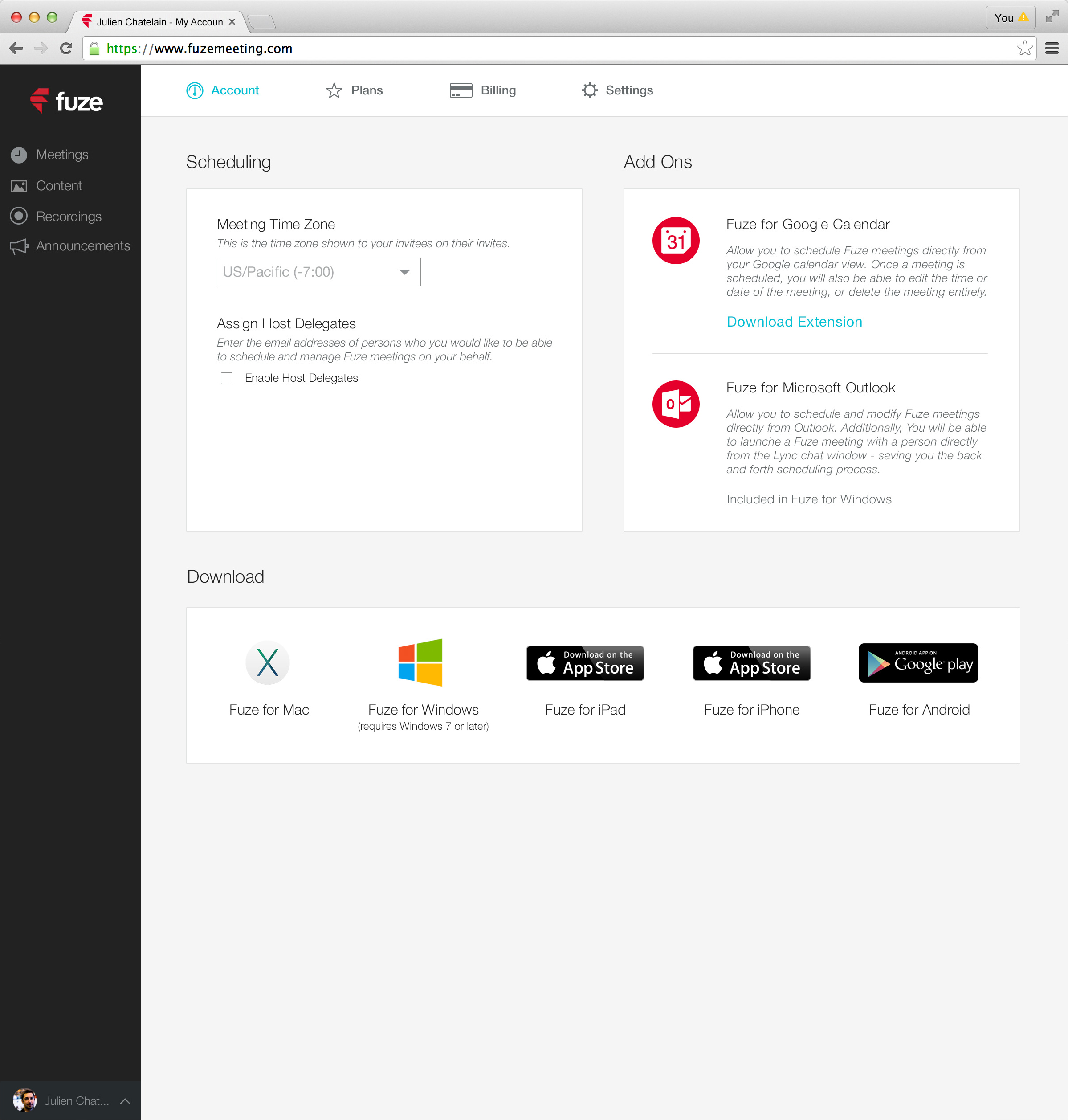
During this time, I worked on several designs for the account, plans, billing and settings pages.
The account page allowed users to manage their profile information, buy audio credits or manage their credit card information. The settings page allowed users to download the meetings application and manage extensions. The billing page provided access to a history of invoices and calls. The plans page allowed users to manage their current plan and downgrade/upgrade to another one.
Redesign proposals for join screens
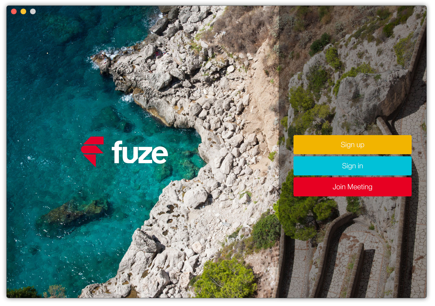
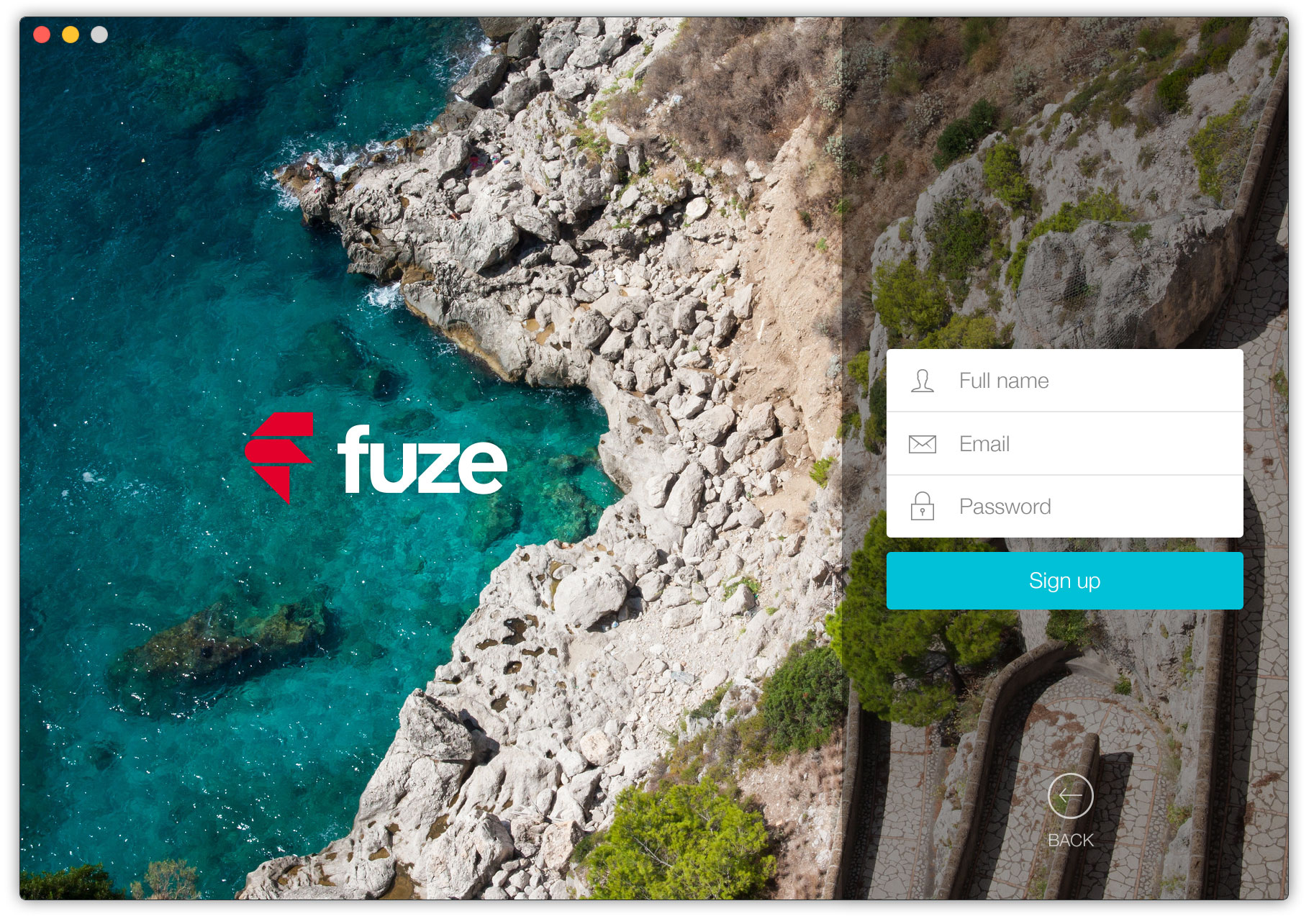
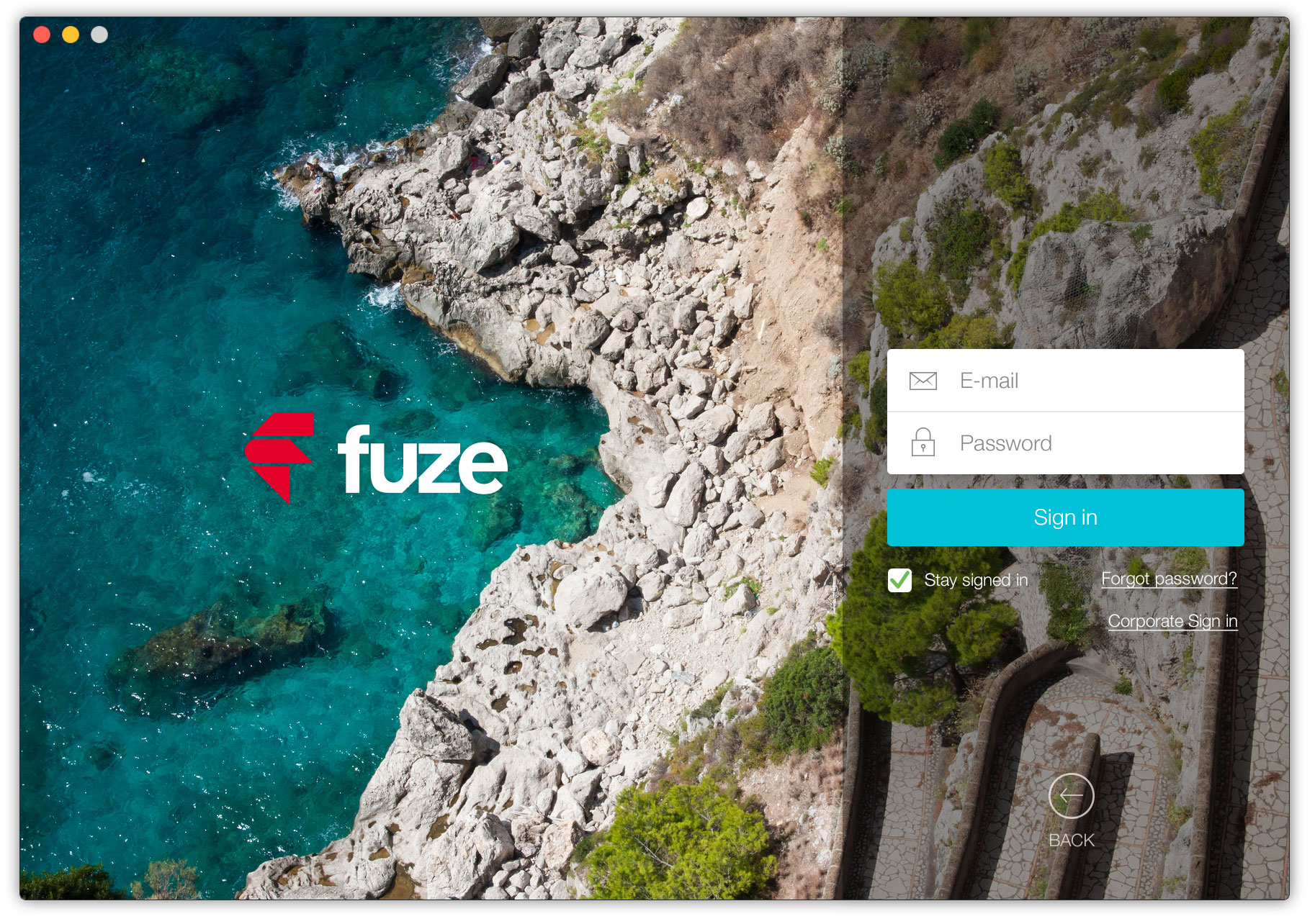
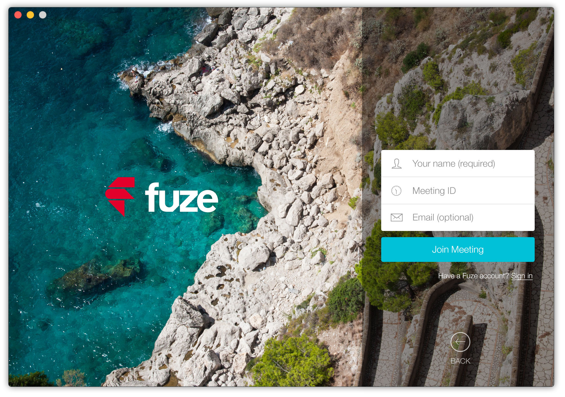
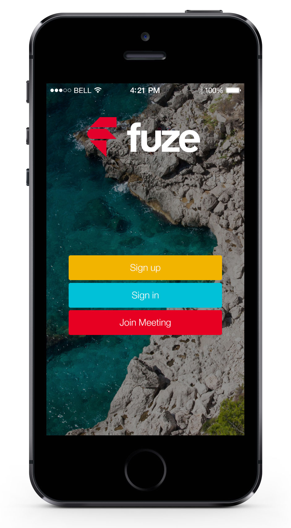
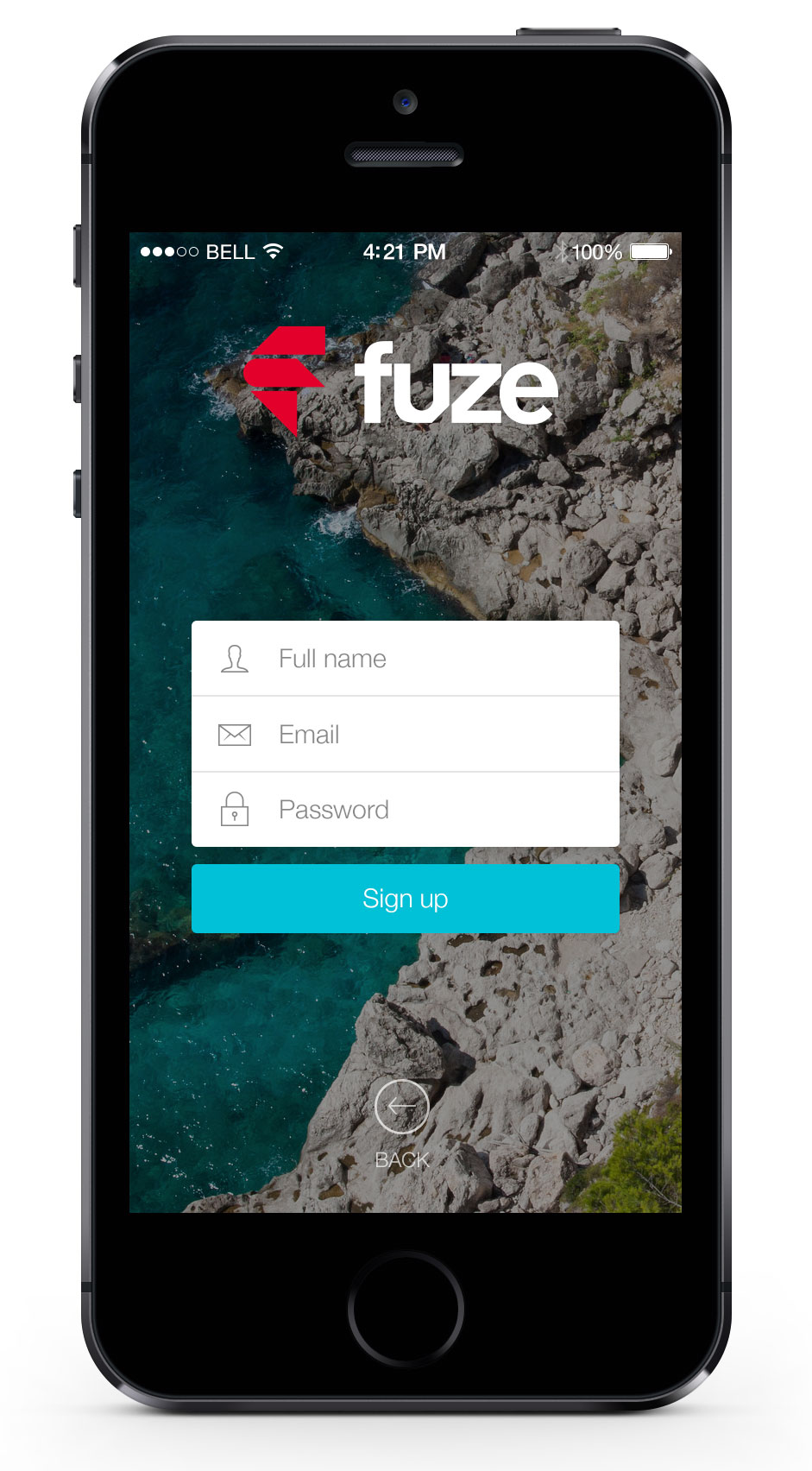
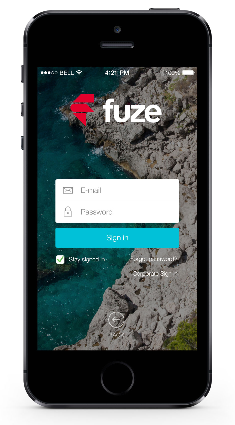
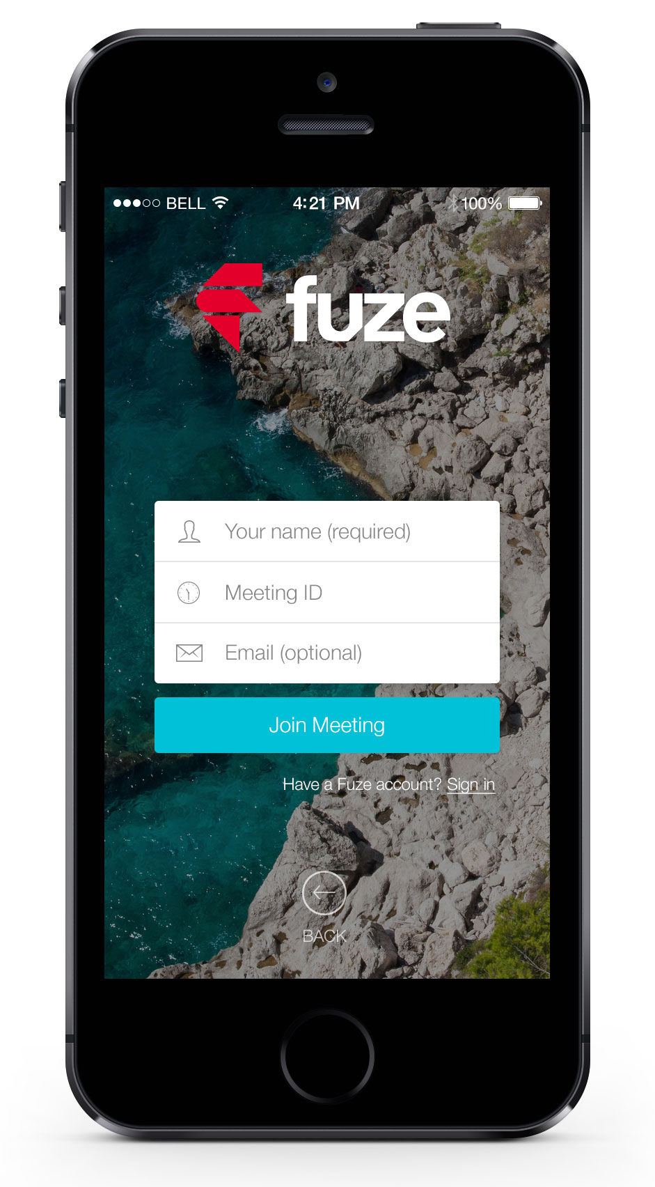
I worked on several design proposals for the join screens (sign up, sign in, join meeting) for the native Mac and iOS applications.
The idea was to have uniform join screens for all platforms. The photo in the background that I took in Italy as well as the place inspired me a lot and I decided to start from that (I was thinking that we could change this image depending on the time of year, season, celebration...).
I then decided to use a color code to differentiate the three possible actions when launching the Fuze application (sign up, sign in, join meeting). After clicking on one of the buttons, a form appears in the same block. I tried to have a clean style, to give an impression of floating, lightness. I used the same process for the join screens on iOS.
