My role
I joined the San Francisco office of Fuze as a Software Engineer at the end of 2015. I was in a team of 4 people and we were responsible for all things that were not in meeting.
My role was to integrate and develop the Out of Meeting application (OOM). I also created designs for several pages and defined a UI Kit and style guide.
Context
In 2015/2016, the Fuze application was split in two: on one hand the applications where the meetings happened (Mac, iOS, Windows, Android) and on the other hand a web application that allowed users to manage their meetings, recordings, access their profile, join a meeting...
Front-end development
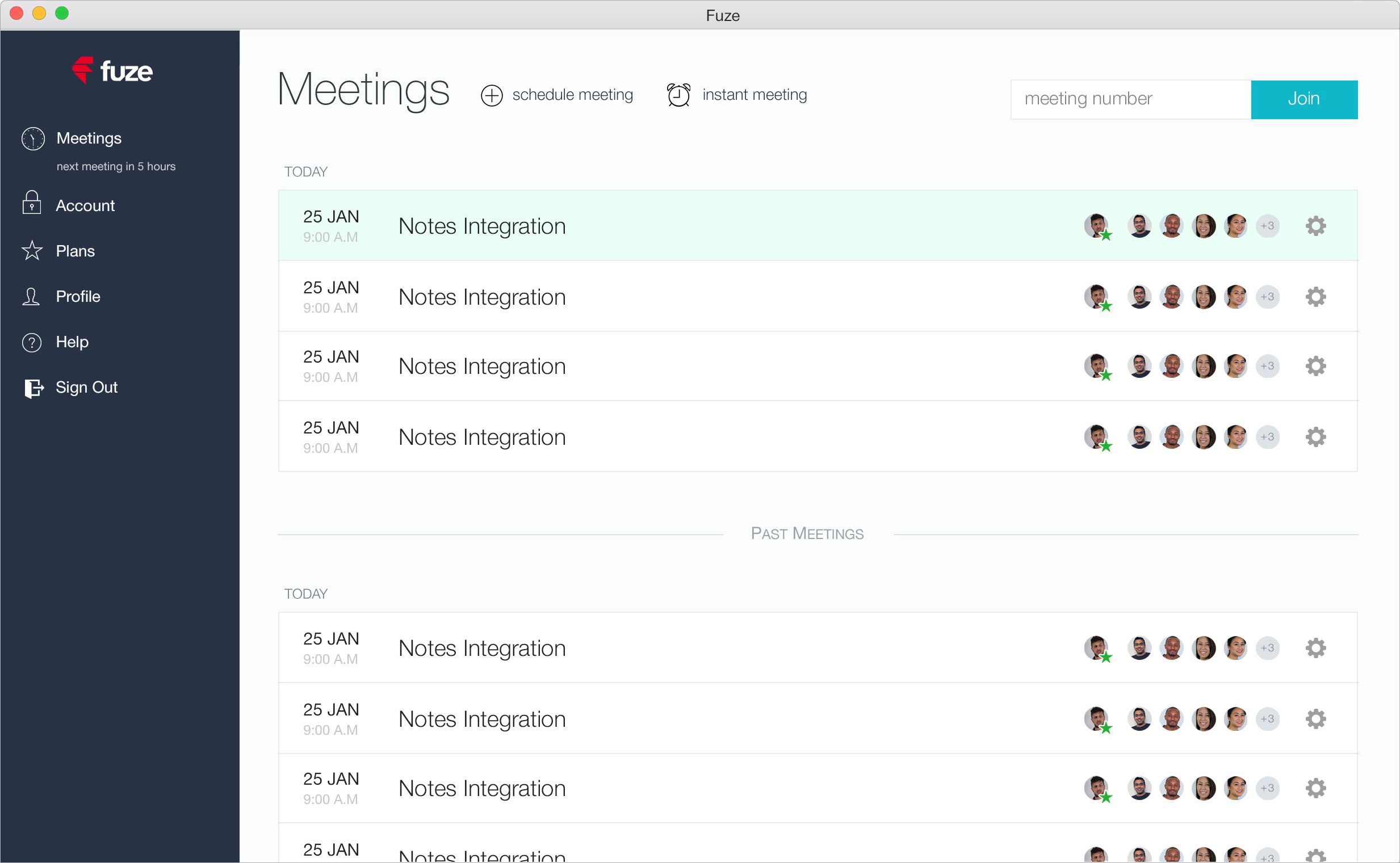
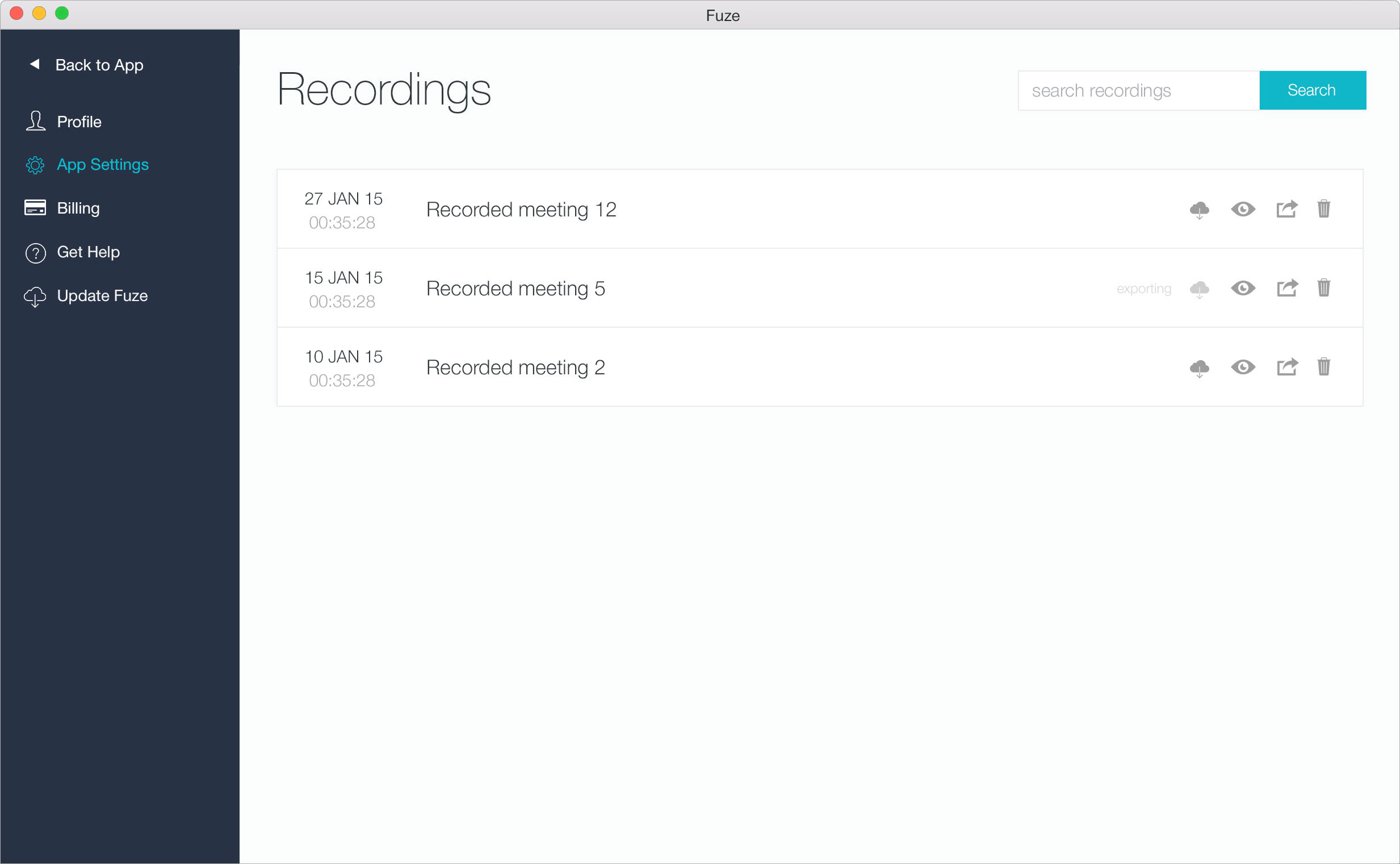
I contributed to the design, integration and front-end development of the meetings and recordings pages for the Out of Meeting application.
The meetings page had to be very simple and answer one goal: join a meeting easily. There were many ways to join a meeting and we decided to split the page in two: a header with the main actions and a main content with the list of meetings.
In the header, we found the main actions: schedule a meeting, launch an instant meeting and join a meeting with its id. For an easy access, this header had to be always visible.
The second part was the list of meetings a user can access. We chose a list instead of cards because there can be a lot of meetings. For better reading, we also decided to split the list in two, today's meetings and all the others. The date, the name of the meeting as well as the avatars of the participants allowed to navigate easily among meetings.
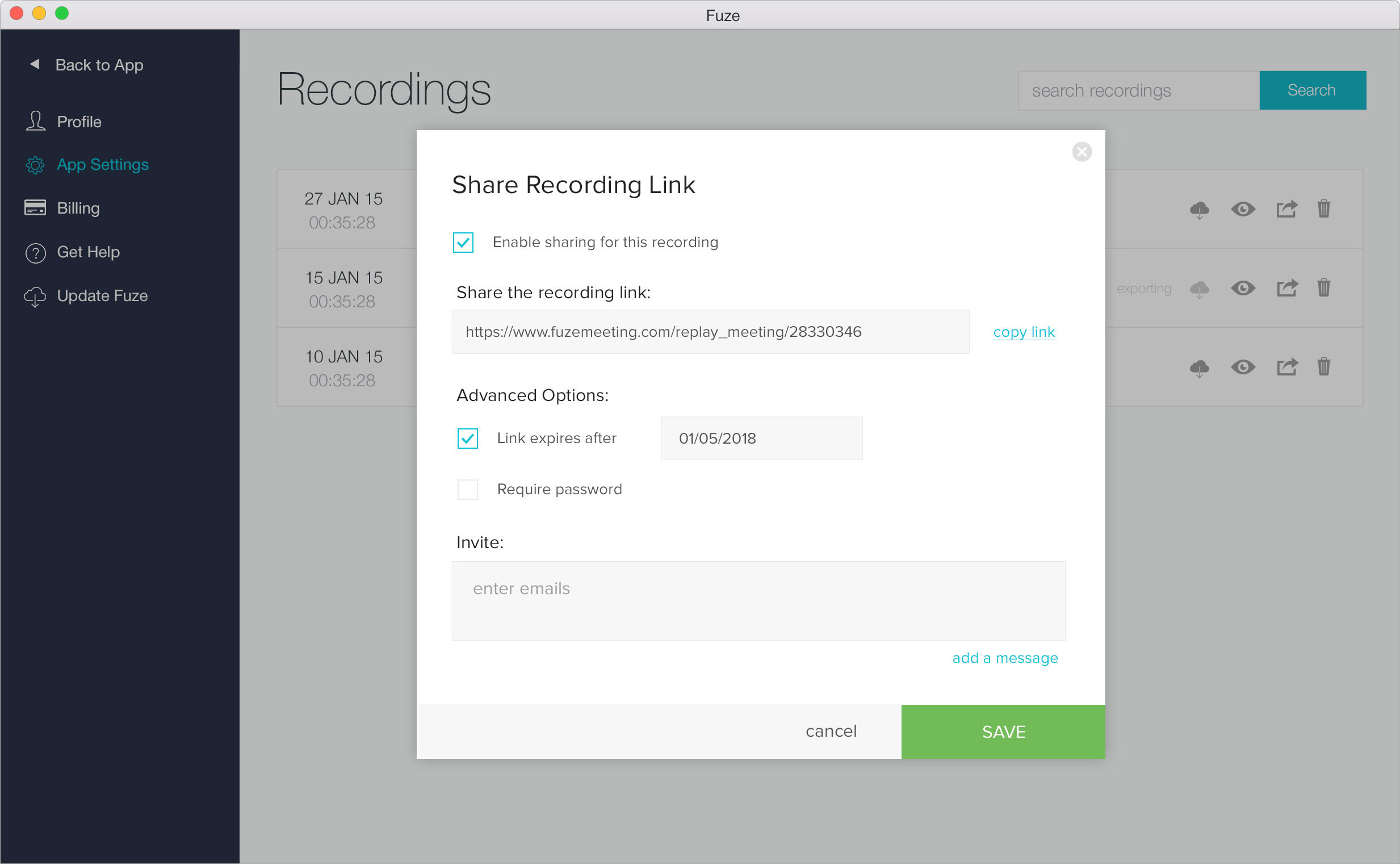
The recordings page used the same design for consistency. As soon as a meeting was recorded, it was available in this page. Several actions were possible such as share or download a recording.
Design
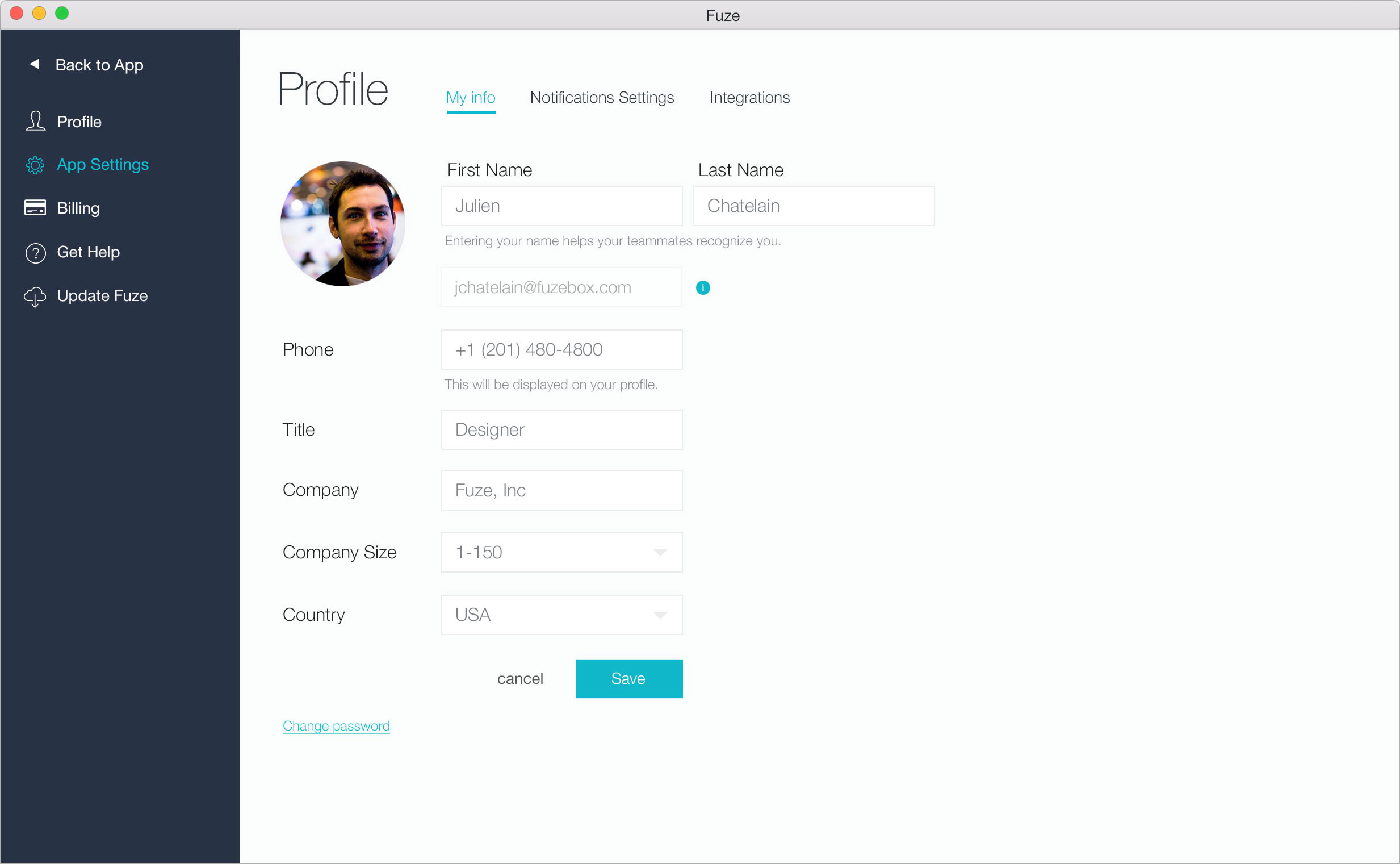
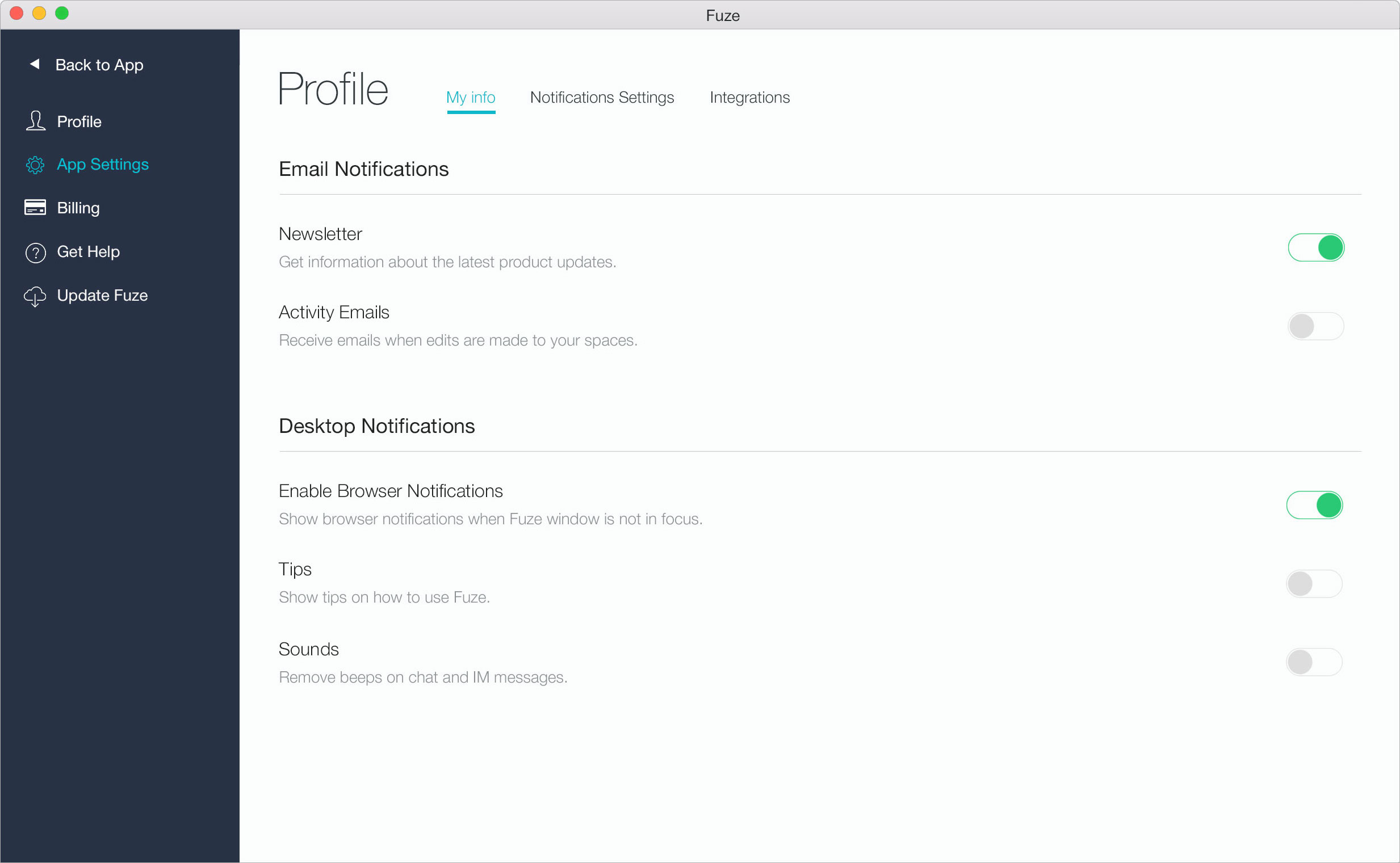
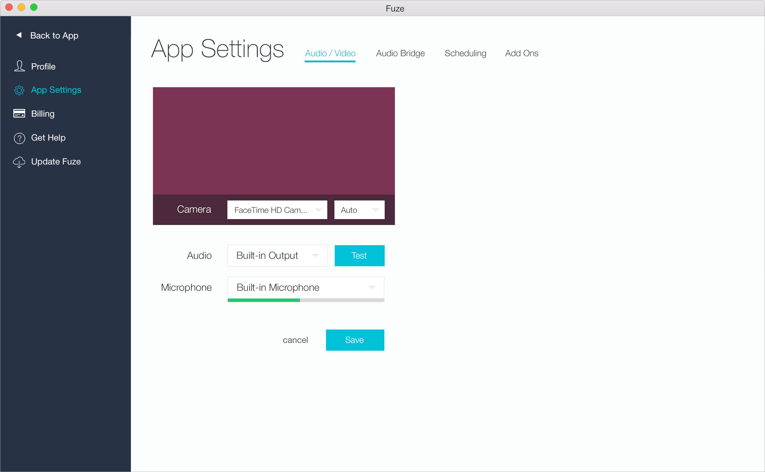
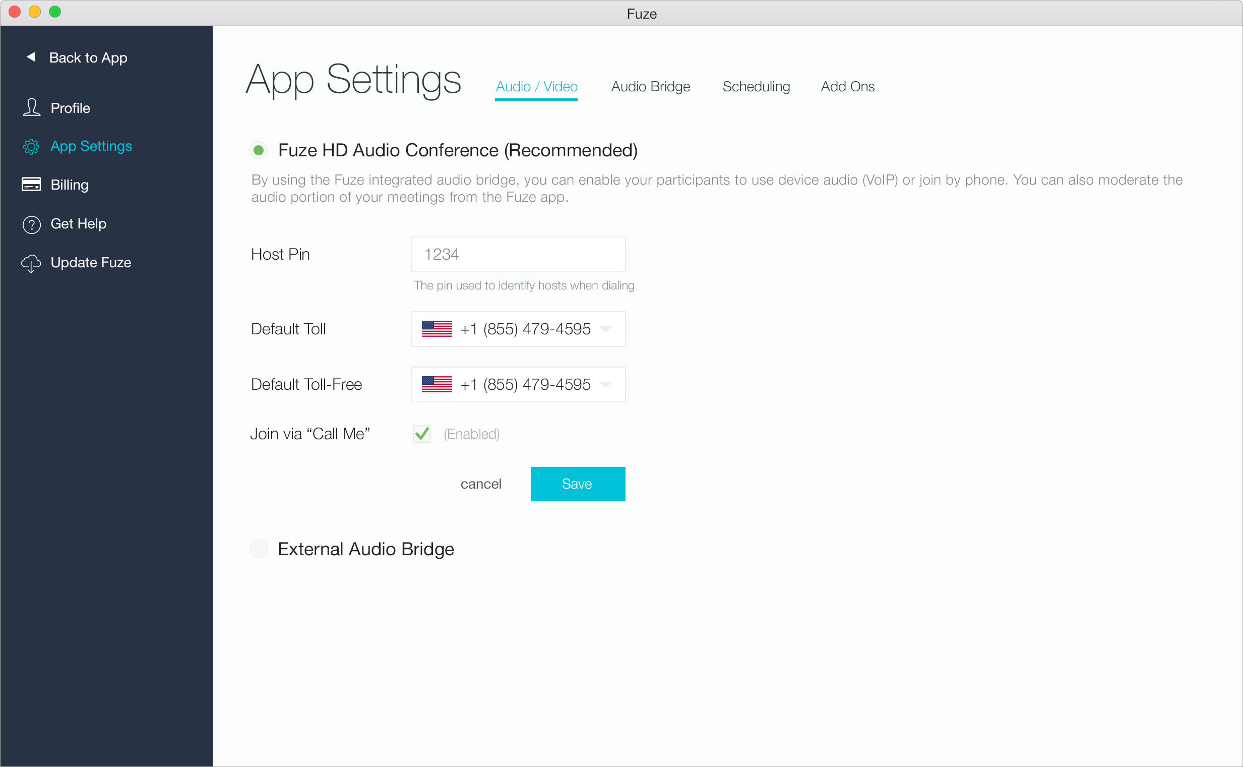
I led the design of the profile and settings pages.
Always with the improvement of the user experience in mind, I worked on the designs of profile and settings pages. I tried to keep the same layout and design as for the existing pages, a header with actions/navigation and a main content below.
The profile page allowed users to manage their personal information as well as the notifications they wanted to receive. The app settings page allowed users to manage everything related to meetings, audio/video settings, phone numbers, addons like Fuze for Google Calendar or Fuze for Microsoft Outlook.
UI Kit & Style Guide
I created the UI Kit and Style Guide for Fuze Out of Meeting and the previous work relies heavily on the kit designed here.
Goal:
The goal was to introduce a UI Kit and Style Guide to bring consistency to the product and improve our development process.
Context:
Four people were working on this web application, there was no style guide and more pages and features were about to be developed.
Actions:
I created a UI Kit and Style Guide so the team could rely on something when developing a new page or a new feature. Colors, CTAs, form elements and page’s header to name a few were available in this guide.
Outcomes:
We were still far from a design system but it was a necessary building stone to something more complete that helped the product be more consistent and the team be more efficient.
