LiveMinutes
Web Application + Website
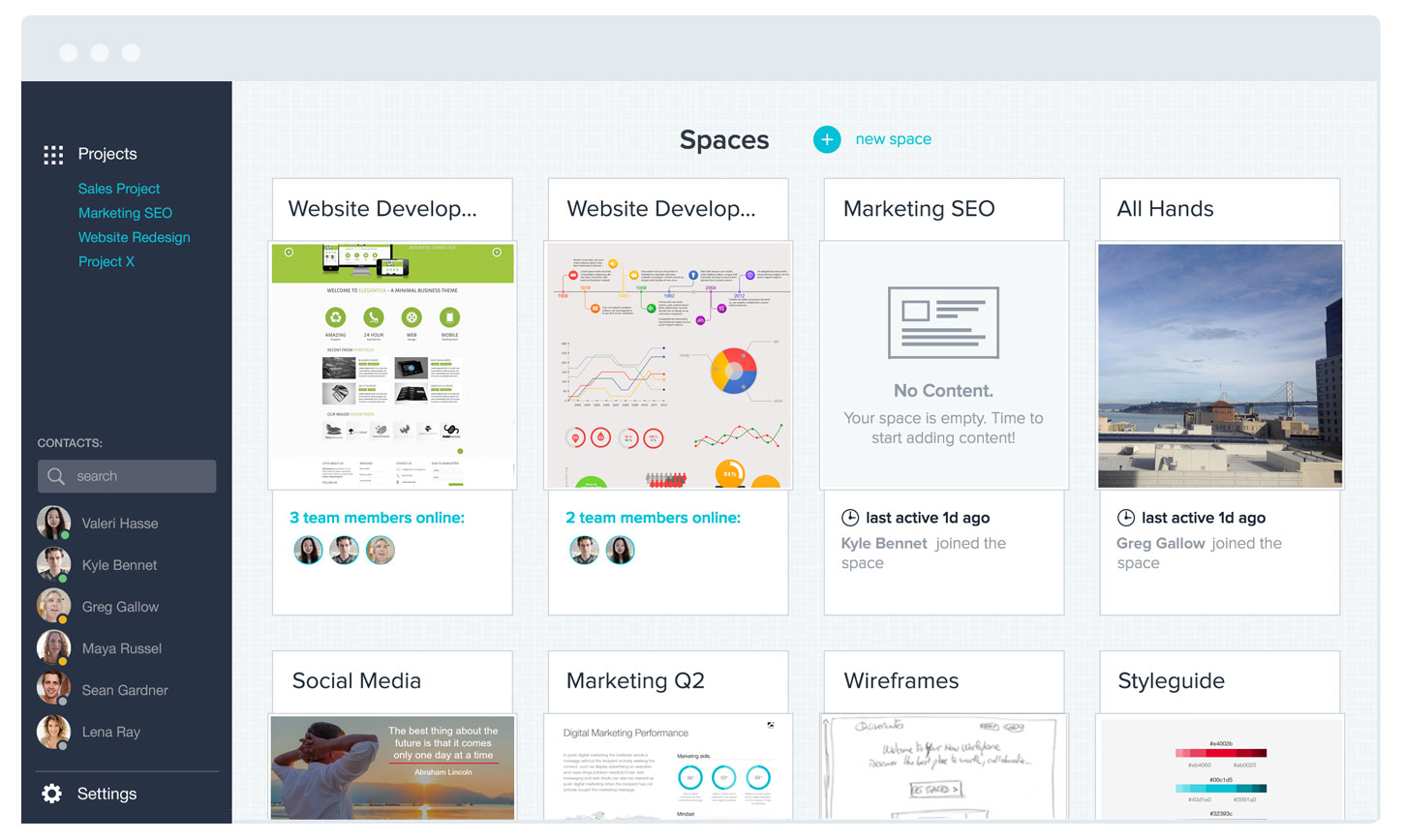
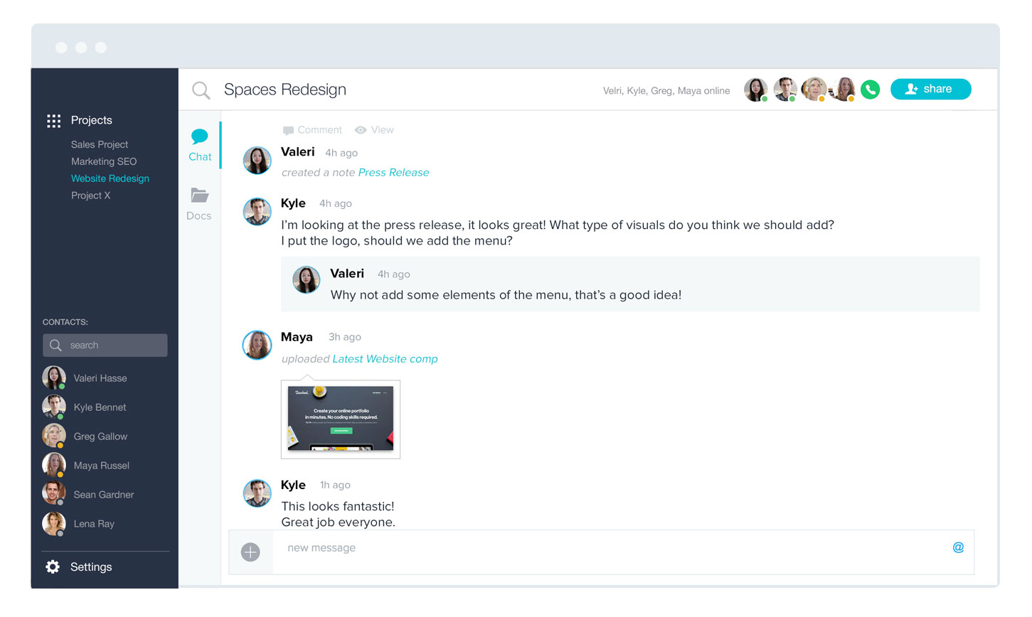
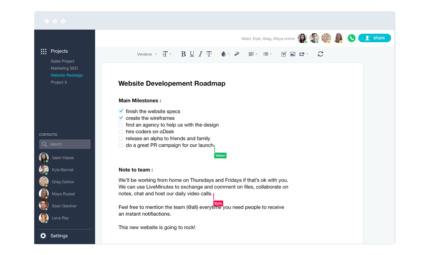
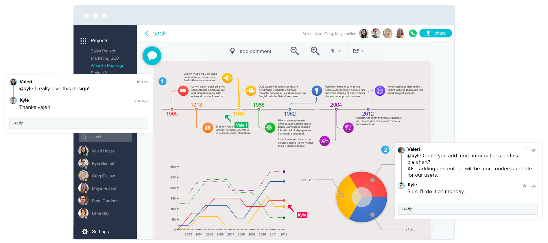
LiveMinutes worked around the concept of workspace. Users were able to create a workspace, invite a team, and start collaborating on notes, designs, slideshows, either asynchronously by leaving comments, or synchronously by launching a conference call, all within a beautiful HTML5 platform.
My role
My role and responsibilities were to design screens and features and then make the integration and front-end development.
I shared the creation of the designs with one of the co-founders.
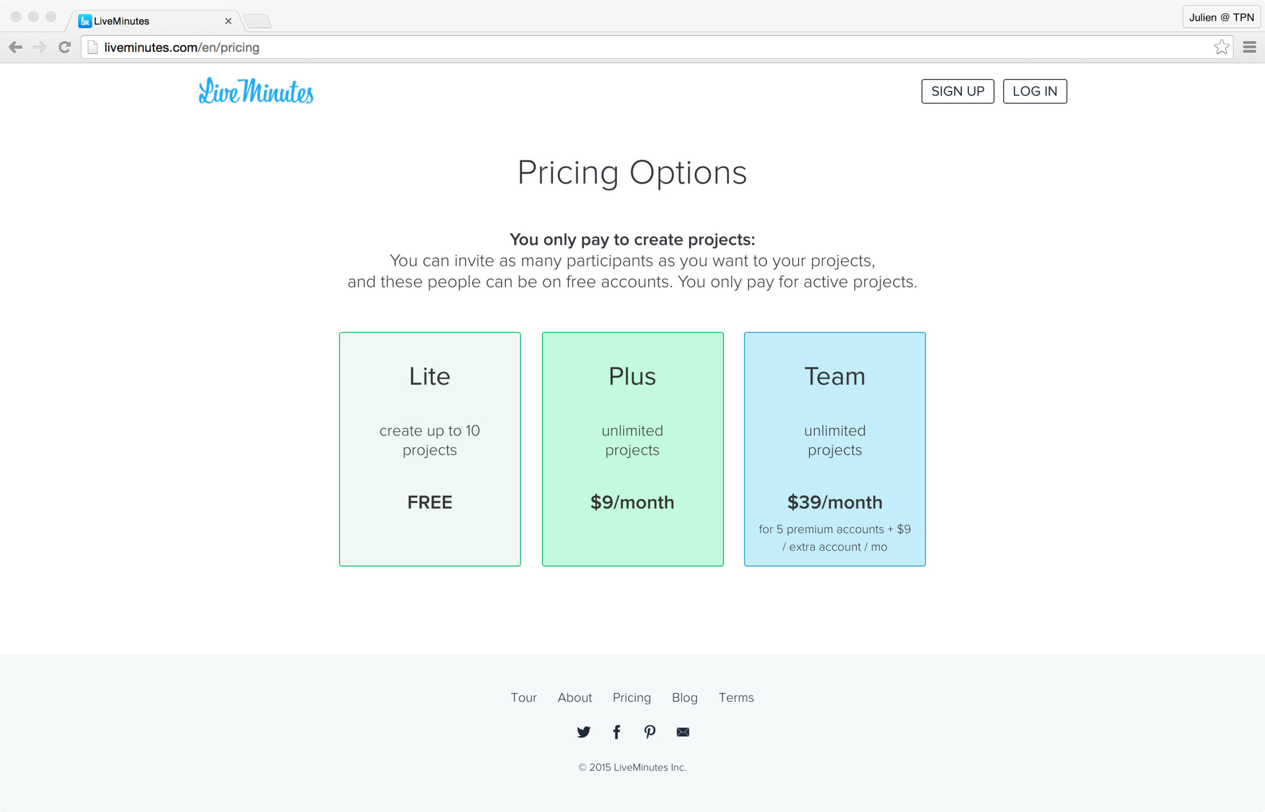
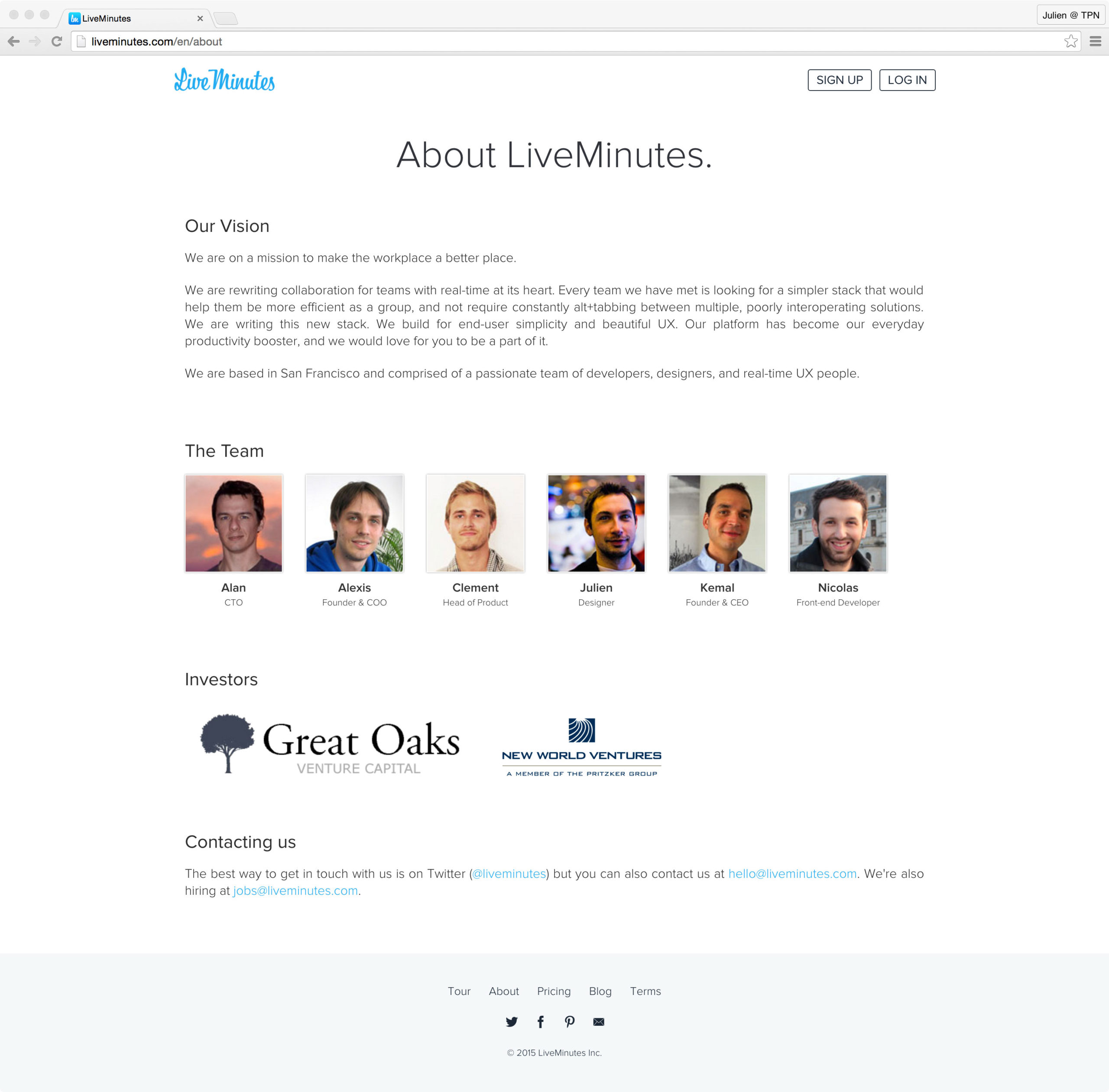
I also designed and developed the latest version of the website.
Context
Prior to launch LiveMinutes, we were specialized in creating real-time applications for the education and elearning spaces. We successfully launched three applications before starting this new project.
With everything we had learned previously, LiveMinutes was our last attempt in the real-time space, for business this time and more precisely for enterprise collaboration. We developed a real-time collaboration platform, including project management, document editing, and web-conferencing in a single beautiful html5 experience.
Design LiveMinutes
During my time on this project, I designed several features of the web application and worked on the integration and front-end development of the application.
I mainly worked on the integration of the web application, from the main layout to the note taking, from chat (threads, reply) to document sharing (pin, comments) and videoconference.
The design of the application was made in collaboration with one of the co-founders. I led the design on several features, including note taking and the dashboard where users could access their workspaces.
Design & develop the website
I led the front-end development of the first two versions of the website and led the design and front-end development of the last version.
Goal:
The goal was to launch a new version of the website and increase the sign up form rate.
Context:
LiveMinutes was a free service with a signup conversion rate that could be higher. The website needed a visual refresh to fit new trends too.
Actions:
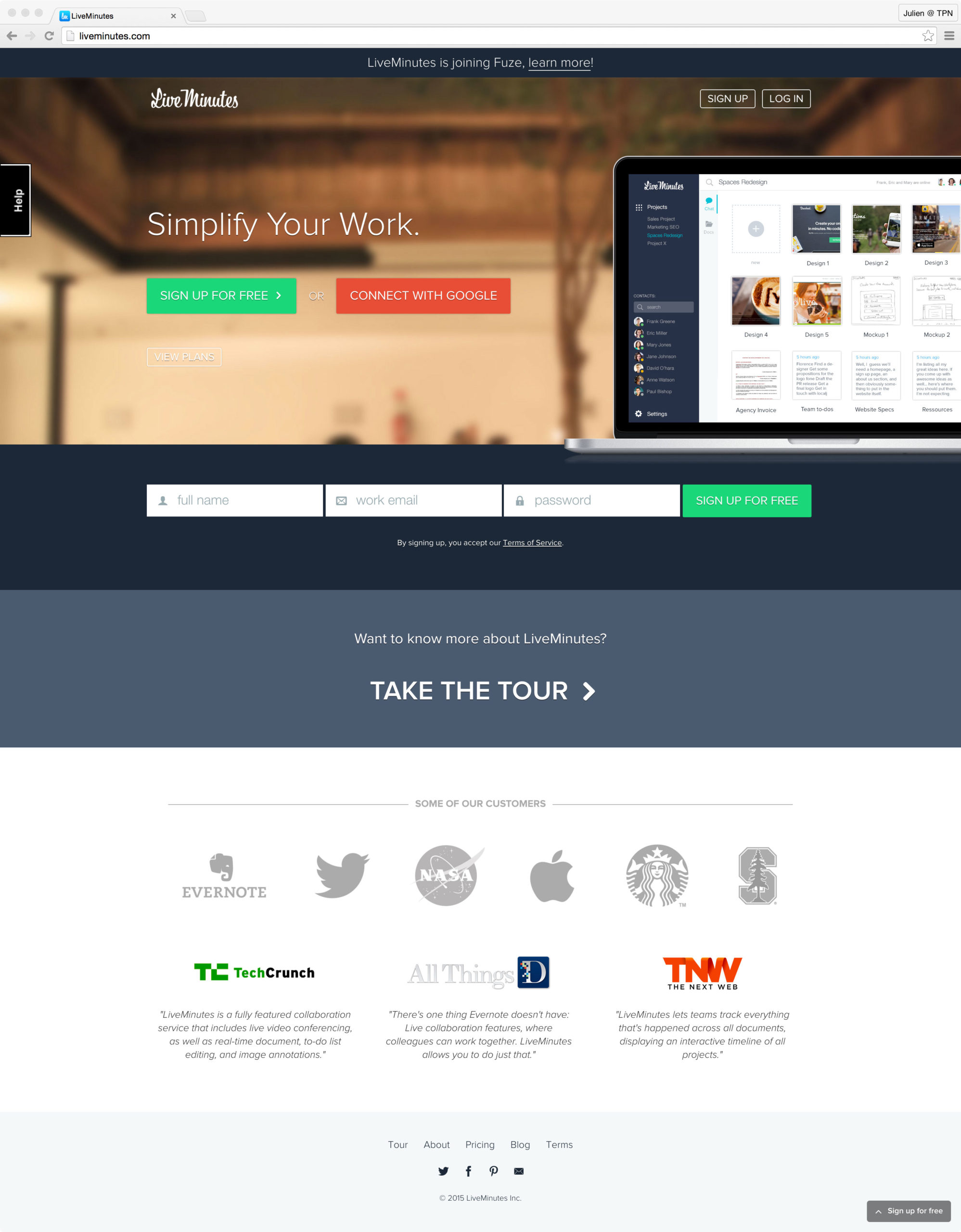
I designed a very simple and minimal homepage with a hero section focused on signup and two more sections: take the tour that led to the features page and testimonials/logos to strengthen our credibility.
I then created two versions of the hero section and decided to A/B test them during a couple of weeks. After reviewing the results, we decided to go with the one that had the best conversion rate.
I also designed the features page. I reviewed the mockups with the team, polished them and then integrate them.
Outcomes:
We saw an increase in the number of sign ups (+15%) after the launch of the new website.
